2020
WASDAS - Corporate Identity
Entrant Company
IDEA 2
Category
Design & Print (NEW) / Corporate Identity
Client's Name
WASDAS
Country / Region
Netherlands
Experience Level
Agency
About The Entry
Wasdas is a high-end car wash. In Dutch the word ‘Was’ means ‘clean’ and ‘Das’ is the Dutch word for ‘badger’.
We were commissioned by De Wasdas to design a corporate identity that is more in line with the high-quality products and service of this high-end car wash. The old logo certainly did not live up to the appearance that a modern top-of-the-line car wash should have.
The Wasdas has a great reputation. Reason not to change the name. However, to give the name more power, we have omitted "de". The ‘badger’ therefore remained and has been abstracted as much as possible in the new logo.
For the typography of the logo, a clear and modern font was chosen. WASDAS is a compound word consisting of 2 syllables that are almost identical: ‘Was’ and ‘Das’. The trick is to simultaneously create unity and also make a clear distinction between these words.
In the logo, red has been chosen as the main color, because this has previously also been the color for the brand and therefore entails a lot of recognition.
In addition, the identity system has been enriched with a secondary orange color as an extra layer that makes the corporate identity more lively.
Large areas with headlines are finally equipped with an elegant grey "stryping" that supports the high-end feeling.
To communicate a 'corporate feel' to the customer, the logo and name are placed in a plane with an oblique angle. We have sought connection with the well-known car brands that often incorporate chrome in their logo, by designing the badger in chrome. This is beautifully reflected in the new illuminated sign in relievo. WASDAS now radiates legitimacy and a high-end feeling and transfers this perfectly to the customer with this rebranding.
The rebranding extends from the design of the car wash itself, the company cars and the clothing of the employees to the coffee cups, dry towels and receipts. Now WASDAS not only stands for an excellent car wash, but also for a complete experience from start to finish.
Featured Media
Credits
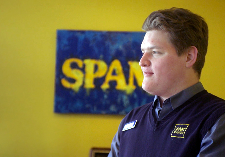
Entrant Company
Attention Span Media
Category
Branded Content / Public Interest / Awareness
Country / Region
United States
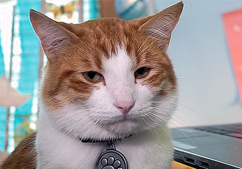
Entrant Company
Carte Blanche Media Inc.
Category
Web Based Production / Pet Care
Country / Region
Canada
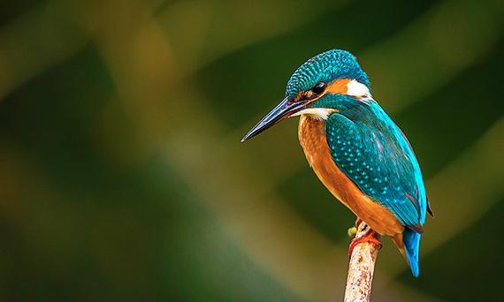
Entrant Company
Three(i) Creative Communications
Category
Website / Nonprofit
Country / Region
United States
Entrant Company
Cloud Construct
Category
Mobile App / Lifestyle
Country / Region
United States