2021
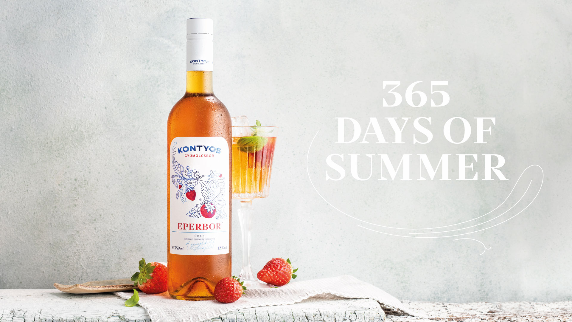
365 days of summer
Entrant Company
Graphasel Design Studio
Category
Design & Print / Packaging
Client's Name
Kontyos Fruit Winery
Country / Region
Hungary
Experience Level
Agency
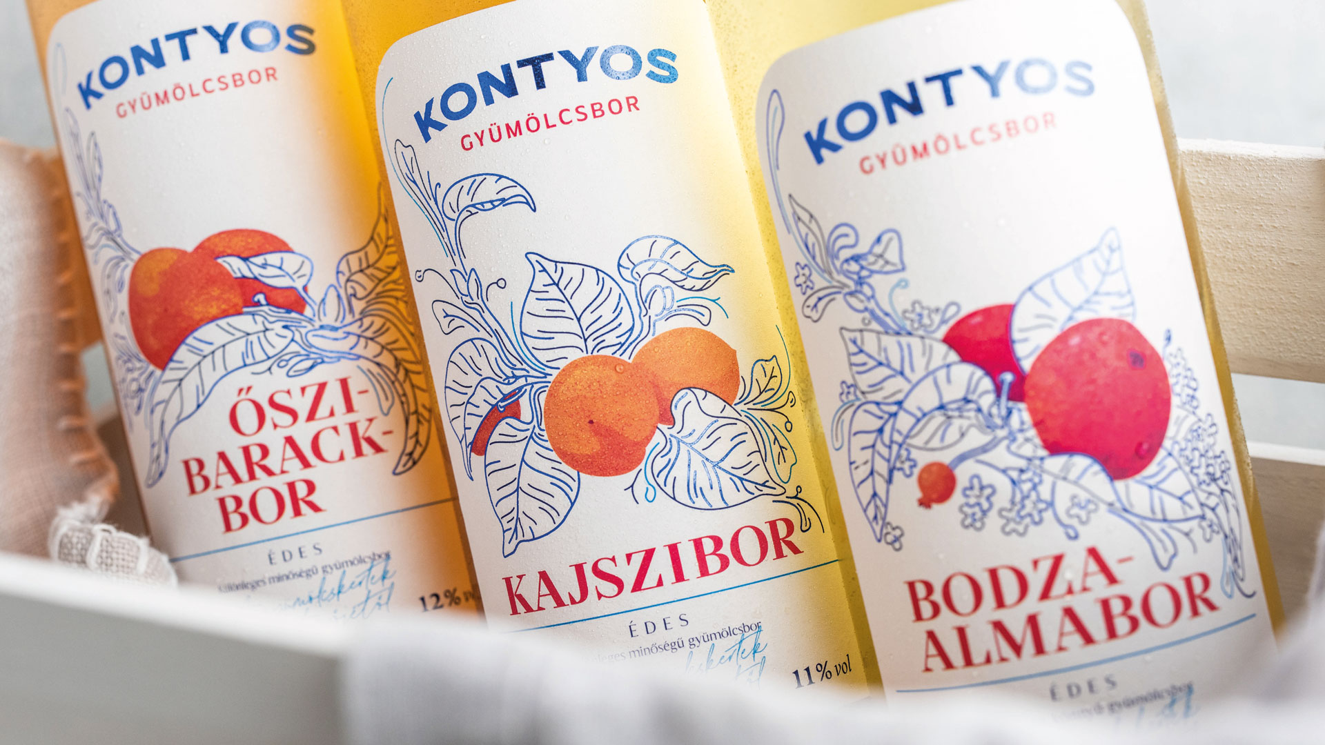
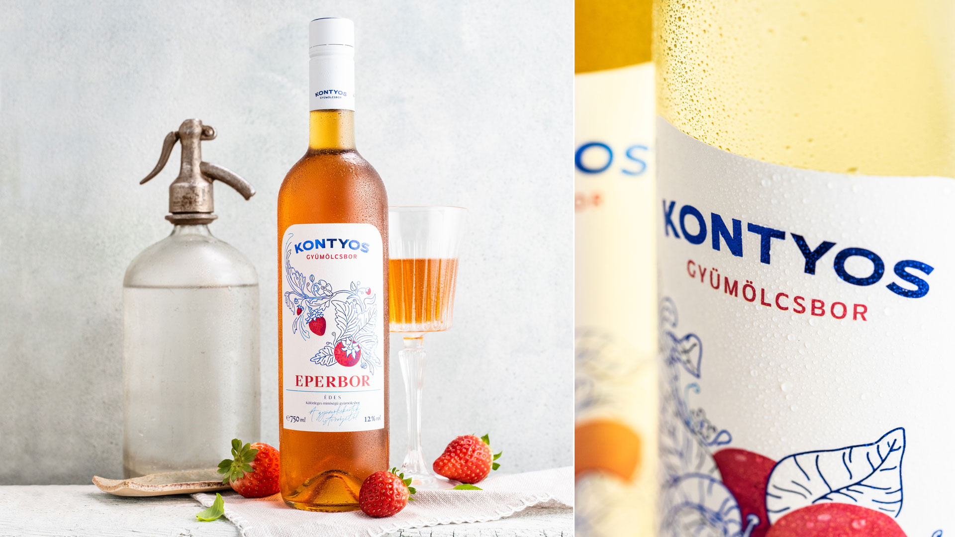
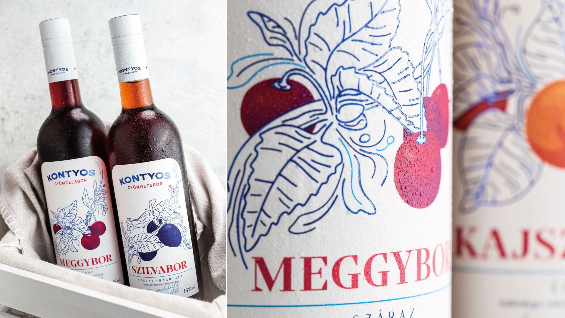
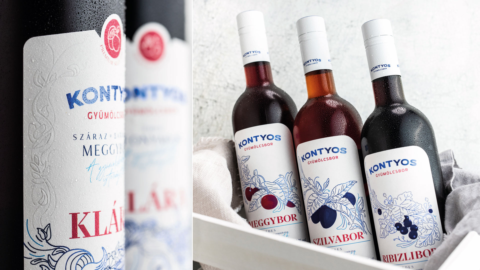
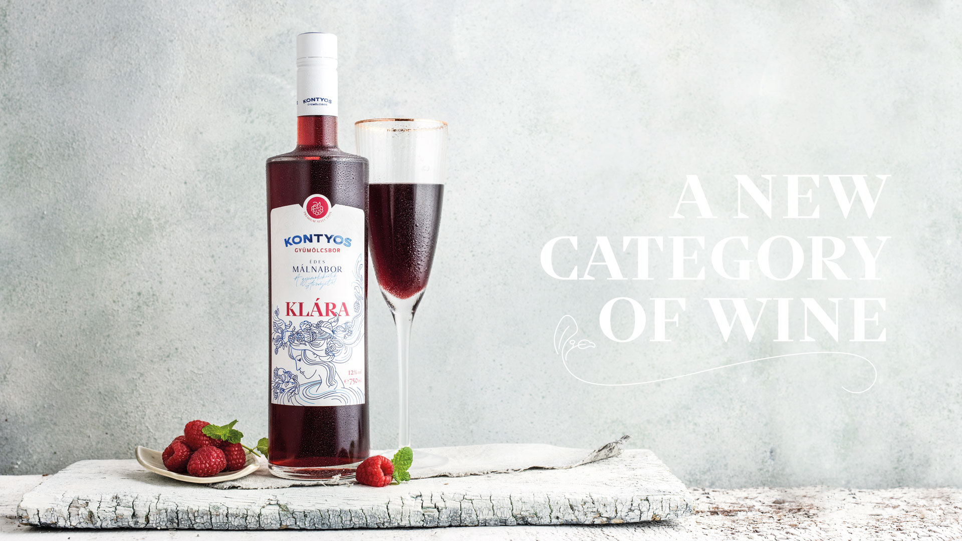
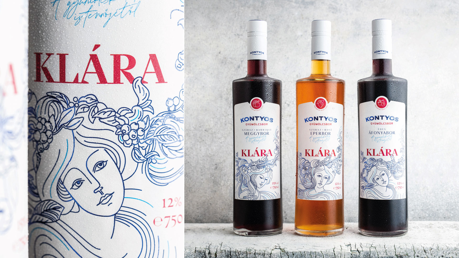
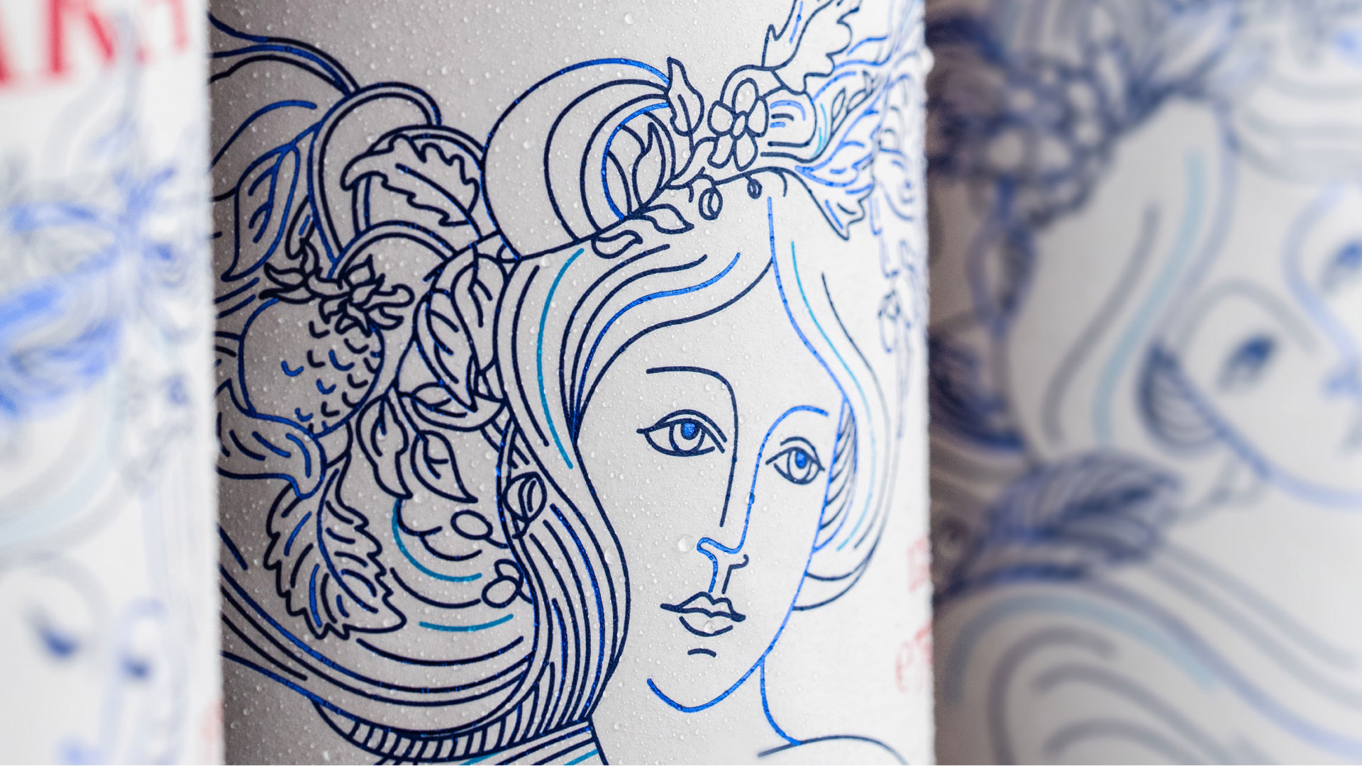
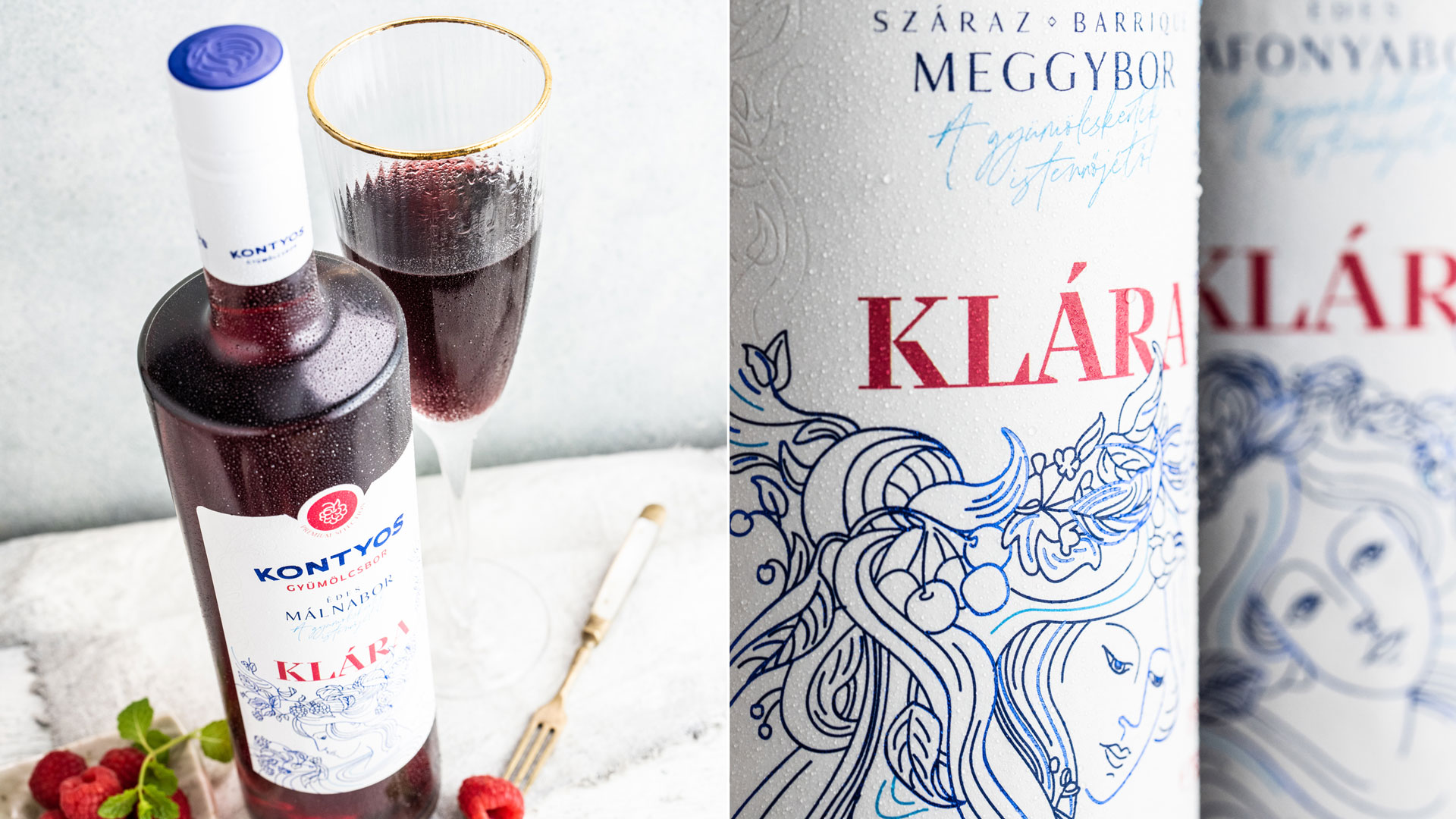
With its traditional-experimental spirit, Kontyos Fruit Winery in Hungary is operating with a traditional and reductive process. Graphasel Design Studio’s assignment was concerned with brand building and packaging design. The aim of the identity change was to introduce the brand, which had previously appeared at festivals, to the retail market. On the packaging, we had to translate the respect for tradition, innovative technology and craftsmanship diligence characteristic of the brand into a unique design language. Kontyos is certainly a beverage of Generation Y. It has been shaped primarily for the taste of young ladies, who prefer to drink fruit wines on exceptional occasions or at summer festivals. That is the origin of the concept of “365 days of summer”: each season has its own scent; summer is characterized by fresh, colourful fruits, the essence of which is carefully sealed in bottles. Kontyos turns everyday little pleasures into a celebration, and its intense fruity flavours fill the moment with the feeling of summer exhilaration. The pricing of the products was quite variable due to the extreme price range of the fruits, so we suggested lifting the more expensive wines into a more exclusive bottle with a separate product name. This is how Klára, the “Goddess of orchards”, was born, a premium fruit wine category with a distinct visual identity. The labels of the basic fruit wines feature the fruits in the graphic style of classic plant identification books. The packaging of the premium wines depicts Klára, the Goddess of the orchards, in the same illustrative style, with four different fruit wreaths. Since the natural colour of Kontyos wines covers the entire warm colour spectrum, we chose blue, the complementary colour, as the base colour, which looks elegant and allows the colours of the fruits to prevail. We played a little with the colour, which sometimes has a metallic shine in a very thin fashion; sometimes it’s lighter, cyan blue, and sometimes has a dark, matte surface. The final result is a carefully designed identity – just like Kontyos fruit wines themselves.
Credits
Entrant Company
Swood Media
Category
Broadcast / Television / Documentary
Country / Region
United States

Entrant Company
Gravity Global
Category
Social Marketing / Communications / Social Campaign
Country / Region
United Kingdom
Entrant Company
SASSO Agency
Category
Social Video / Food & Beverage / Restaurant
Country / Region
United States
Entrant Company
The MRN Agency
Category
Strategic Communications / Event Campaign
Country / Region
United States
