2026

Ports of Genoa Logo
Entrant Company
Arachno Srl
Category
Advertising & Design / Logo Design
Client's Name
Ports of Genoa Authority
Country / Region
Italy
Experience Level
Agency
Gallery

About The Entry
The ports of Genoa and Savona-Vado are undergoing a profound transformation, driven by new investments, stronger logistical integration, an increasingly central role in international trade flows, and a determined commitment to the energy transition and the decarbonisation of port activities.
To represent this evolution in a coherent and effective way, the Western Ligurian Sea Port Authority has adopted a new visual identity and the renewed Ports of Genoa logo, both conceived to communicate clearly the strategic direction now shaping the future of the system.
More than eight years after the establishment of the Port Authority, the overall context has changed significantly. The Ports of Genoa have strengthened their position as a strategic multifunctional and intermodal platform in the Mediterranean, while the Authority is managing a broad programme of infrastructure, environmental, technological and digital projects worth more than €3.6 billion. At the same time, the needs related to positioning, recognisability and institutional representation have also evolved. The new brand identity was therefore conceived as a tool for coordination and national representation, able to make visible an evolution already well underway: that of a system operating in an increasingly integrated, competitive and coherent manner, in line with Italian and international best practices.
These principles are visually expressed in the new logo. Four geometric modules represent Vado, Savona, Pra' and Genoa in a unified composition, symbolising the integration of distinct operational identities under shared strategic governance. The inclination of the forms suggests direction, movement and dynamism, evoking the role of an intermodal hub connecting maritime traffic with the main European logistics corridors. The colour transition from blue to green recalls the continuity between sea and land networks and reflects the Authority’s commitment to environmental sustainability, while the Italian tricolour underlines the national dimension and the strategic role of the Port Authority within Italy’s logistics system.

Entrant Company
TechSpaces Education Inc.
Category
Strategic Campaign / Technology Campaign
Country / Region
United States
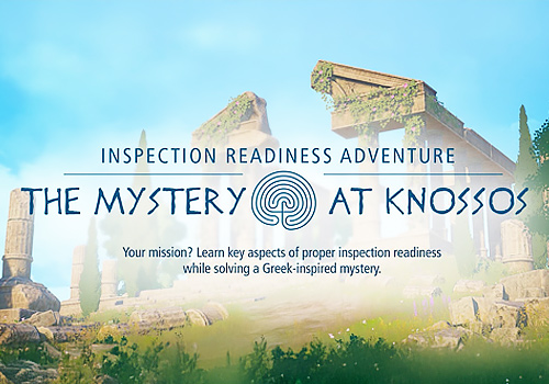
Entrant Company
Tipping Point Media
Category
Website / Training / Knowledge Base
Country / Region
United States

Entrant Company
Acg Edu
Category
Advertising & Design / Editorial Spread Design
Country / Region
China

Entrant Company
Berman and Company
Category
Website / Nonprofit
Country / Region
United States