2026
Tano Skincare: A Tactile Story in Banana Leaf + UV Texture
Entrant Company
The Copper Portico
Category
Advertising & Design / Packaging Design (Single)
Client's Name
Tano Skincare
Country / Region
United States
Experience Level
Agency
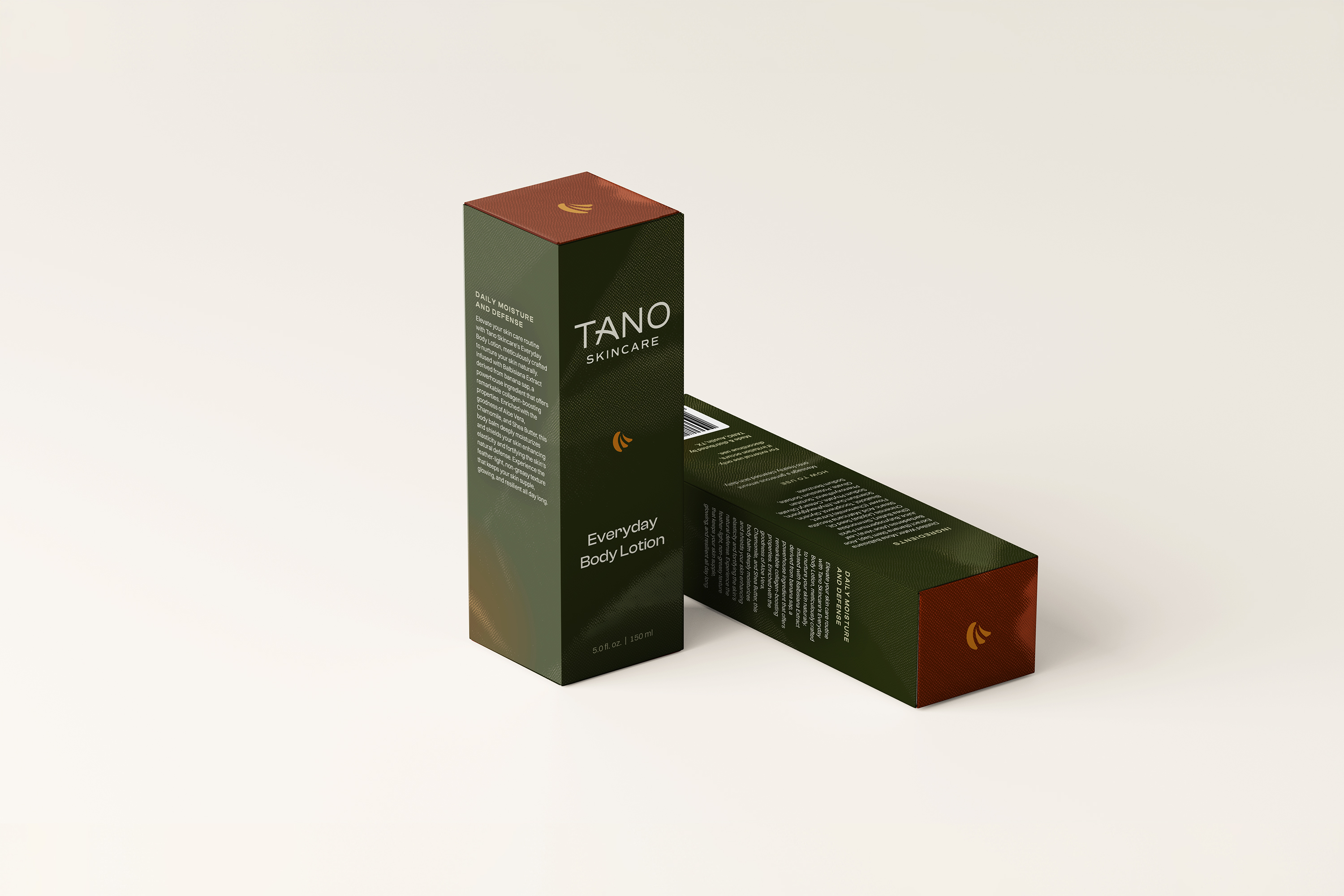
Tano Skincare is all about one thing: Balbisiana Banana Sap. We wanted the packaging to tell that story the second someone picks it up, before they read anything.
The box is a deep forest green with a terracotta cap. It feels grounded and warm, and it pops in a category that's mostly white and pale pink. A little gold leaf icon acts like a signature across the line.
But the real difference is how it feels in your hand. We created a pattern based on the banana leaf and finished it with a raised UV texture, so you can actually feel the leaf structure. It's subtle, but it works: people pick it up and start running their fingers over it without even realizing they're doing it.
Then you open it: bright green leaves against terracotta. A little surprise that makes the whole experience feel considered, not just functional.
The end result is packaging that looks like it's been on the market for years, and makes you want to reach for it.
Credits

Entrant Company
Kaufman and Canoles
Category
Website / Law & Legal Services
Country / Region
United States

Entrant Company
McGuffin Creative Group
Category
Content Marketing / Magazine
Country / Region
United States
Entrant Company
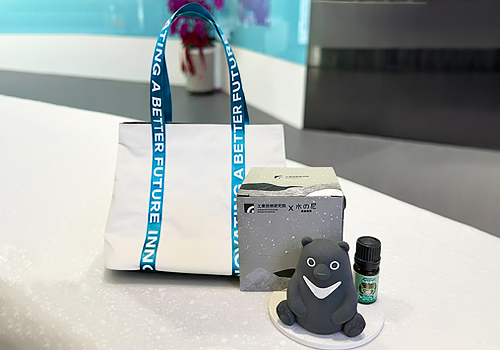
Industrial Technology Research Institute (ITRI)
Category
Advertising & Design / Promotional Item Design
Country / Region
Taiwan
Entrant Company
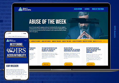
The Herald Group
Category
Public Relations Campaign / Government Affairs and Lobbying
Country / Region
United States